Reach
Making care feel brighter, friendlier and more accessible.
Visual Identity • Web Design • Web Development • Animation • Videography
Brand
Websites
Marketing
Client
CareHub
A brand built for the next generation of care.
As one of CareHub's newer services, Reach supports children and young adults who require care and support. While the service had grown successfully under the wider CareHub brand, it needed its own identity that better reflected the audience it serves.
The goal was to create a sub-brand that felt welcoming, positive and engaging, giving young people and their families confidence when accessing support, while remaining recognisably part of the CareHub family.
The goal was to create a sub-brand that felt welcoming, positive and engaging, giving young people and their families confidence when accessing support, while remaining recognisably part of the CareHub family.

Creating a vibrant identity with purpose.
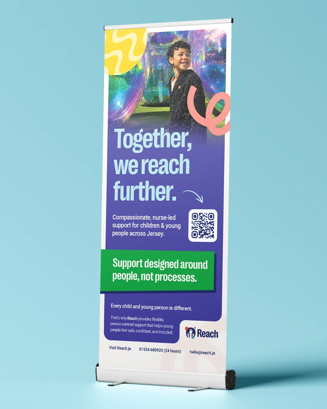
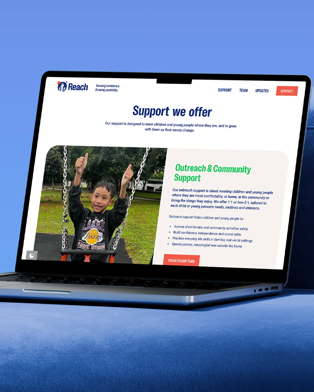
We developed a complete sub-brand that balanced personality with accessibility. From the visual identity and brand messaging through to copywriting, website design and development, every touchpoint was created with young people in mind.
We expanded CareHub's existing colour palette to create a brighter, more playful identity, paired with accessible typography and friendly illustrations to ensure the brand felt inclusive and easy to engage with. Beyond the brand itself, we delivered a fully responsive website, produced campaign creative including video and static advertising, and designed a suite of printed materials to support the service offline.
We expanded CareHub's existing colour palette to create a brighter, more playful identity, paired with accessible typography and friendly illustrations to ensure the brand felt inclusive and easy to engage with. Beyond the brand itself, we delivered a fully responsive website, produced campaign creative including video and static advertising, and designed a suite of printed materials to support the service offline.

Balancing playfulness with professionalism.
Designing for such a broad age range presented the biggest creative challenge. Reach needed to appeal equally to young children, teenagers and young adults without feeling too childish or overly mature.
The brand also needed to make care feel less intimidating, helping remove barriers for those seeking support while maintaining the professionalism and trust associated with CareHub. Striking this balance across every visual and written element was key to creating a brand that would resonate with both service users and their families.
The brand also needed to make care feel less intimidating, helping remove barriers for those seeking support while maintaining the professionalism and trust associated with CareHub. Striking this balance across every visual and written element was key to creating a brand that would resonate with both service users and their families.
The Result:
A stronger brand for a growing healthcare organisation.
The finished brand gives Reach a distinctive identity while sitting comfortably alongside CareHub's wider family of services.
Vibrant, approachable and instantly recognisable, the new sub-brand enables communications to speak directly to its audience across digital and print. The client was delighted with the outcome, feeling the brand captured the brief perfectly and provided a strong platform to support the continued growth and awareness of the Reach service.
Vibrant, approachable and instantly recognisable, the new sub-brand enables communications to speak directly to its audience across digital and print. The client was delighted with the outcome, feeling the brand captured the brief perfectly and provided a strong platform to support the continued growth and awareness of the Reach service.



Let's shape what's next.
Looking for a partner who can match your ambition? You're in the right place.
Get In Touch