
While the alcohol aisles often blend into a sea of subdued bottles, the wine world is slowly awakening, catching up to the quirkier craft ale market and infusing a dash of spice into their brand identities – we’re here for it.
Stand-out brands are ditching the stale visual identities of yesteryear and embracing bold designs and tongue-in-cheek messaging. Why? Those in their 30’s and 40’s now account for nearly 60% of ‘ global, total wine spend’. And Millennials don’t stand for boring when it comes to branding.
Modern consumers have grown tired of stuffy wine brands. They’re in the market for something fresh, new, and exciting. It’s time to get creative with colour, contrast, negative space, and illustrations and sing to the souls of Millennials who have graduated from nights on the razz to nights around a dinner table.
Enter our Snap Picks, where Fringe Société, Hoja de Parra, Damajuana, San Huberto, and Press + Bloom redefine the essence of wine branding.

Hoja de Parra
Bold and quirky packaging can make a brand feel approachable. Perspectiva perfectly captures this eccentric vibe with Hoja de Parra, a wine bar in Mexico. Their pink labels and playful illustrations break away from typical wine packaging, reflecting the restaurant’s retro style.

Fringe Société
Fringe Société celebrates the commitment of like-minded French vignerons to crafting quality wines with care, soul, and a touch of quirkiness. This ethos is reflected in the brand and packaging design. Every label is designed to highlight the distinct flavour profile and personality of the wine it represents.

Damajuana
Blavet Studio pays tribute to traditional winemaking with its ‘Damajuana’ brand, drawing inspiration from the iconic glass demijohns used for wine storage. The label features an illustrated female figure designed to resemble a demijohn, celebrating the generations of women who have dedicated their efforts to winemaking.
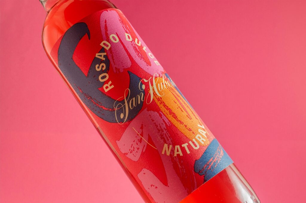
San Huberto
Drawing inspiration from a vintage Calvet San Huberto label, Yani&Guille&Co. aimed to blend the brand’s current typography with custom-designed lettering. The result: a series of sweet white and rosé wine labels featuring copperplate lettering and calligraphic backgrounds, highlighting a focus on colour, textures, and the new wordmark.
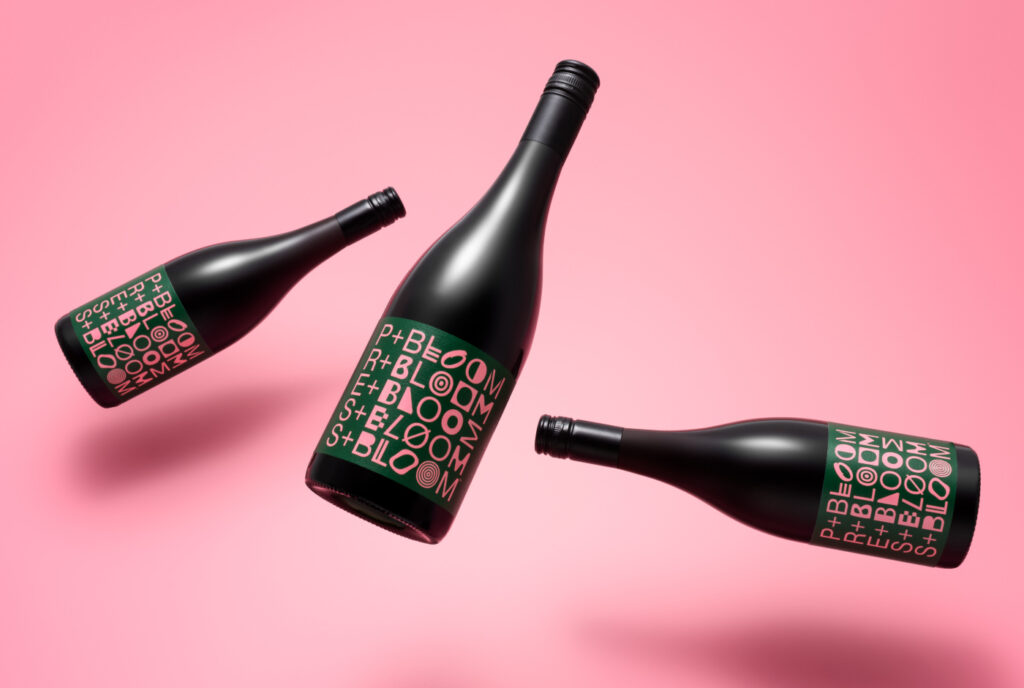
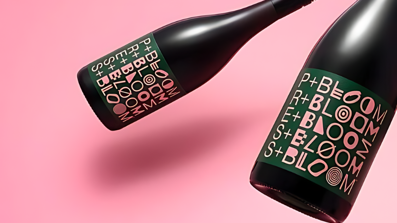
Press + Bloom
Press + Bloom, an experimental wine and spirits brand, merges traditional categories through winemaker and craft beverage artisan collaborations. ‘Press’ signifies wine’s constancy, while ‘Bloom’ represents the changing collaborators. The label design illustrates this relationship through a typographic system, where ‘Press’ remains consistent and ‘Bloom’ is depicted in eclectic letterforms.
So there you have it – our fave wine brands making a splash with their packaging. It just goes to show, a little creativity can go a long way and make your product stand out from the crowd.