Make it
Snap Design & Digital 2026 ©
11:57PM

Versatile by Design.


Strategy
Strategy first. Always. Before we design, build, or market anything, we get the thinking right.
Brand Strategy
Website Strategy
Marketing Strategy
Website Strategy
Marketing Strategy
Digital Strategy
Vision & Mission
Audits & Action Plans
Vision & Mission
Audits & Action Plans

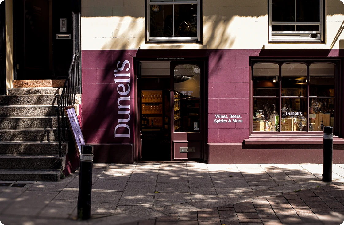
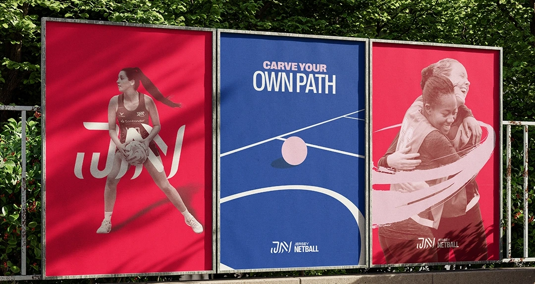
Brand
From visual identity to tone of voice, we craft systems
that look sharp, feel right,
and scale with you.
Brand Identity
Logo Design
Motion Design
Video Projects
Logo Design
Motion Design
Video Projects
Print Design
Large Format Design
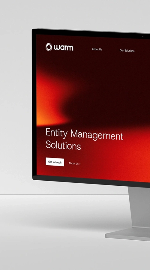
Web Design
Large Format Design
Web Design

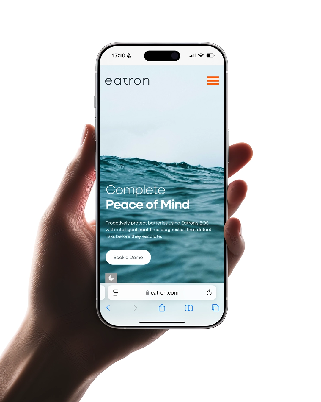
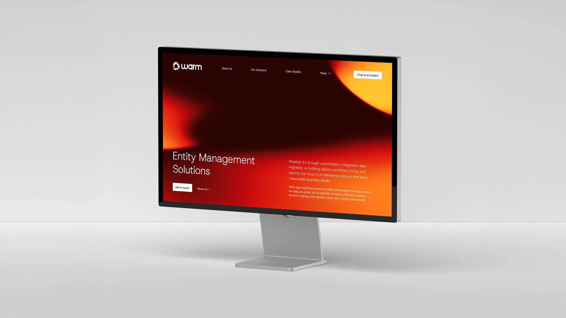
Websites
We create digital platforms that look great, feel intuitive, and deliver measurable impact. Always strategic, always built for growth.
UX/UI design
Website Development
Content Strategy
Website Development
Content Strategy
Copywriting
Premium Hosting
Ongoing Support
Premium Hosting
Ongoing Support

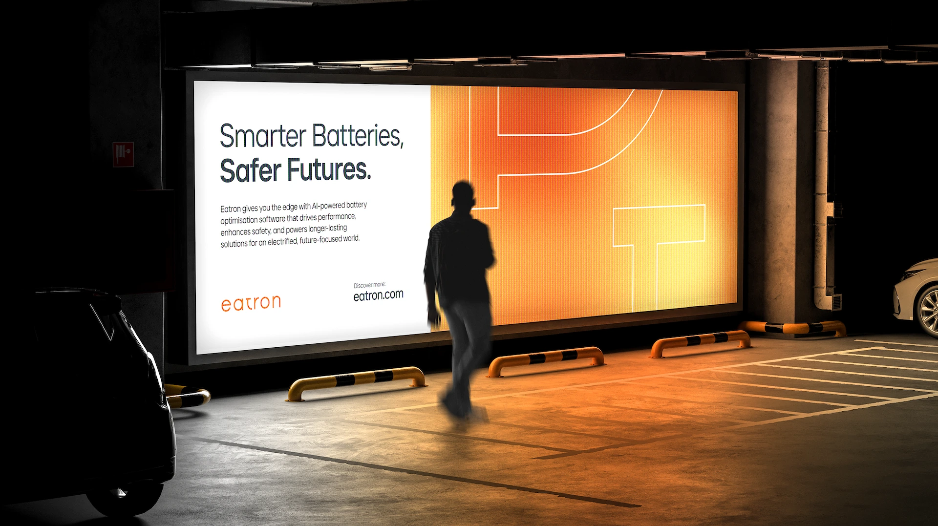
Marketing
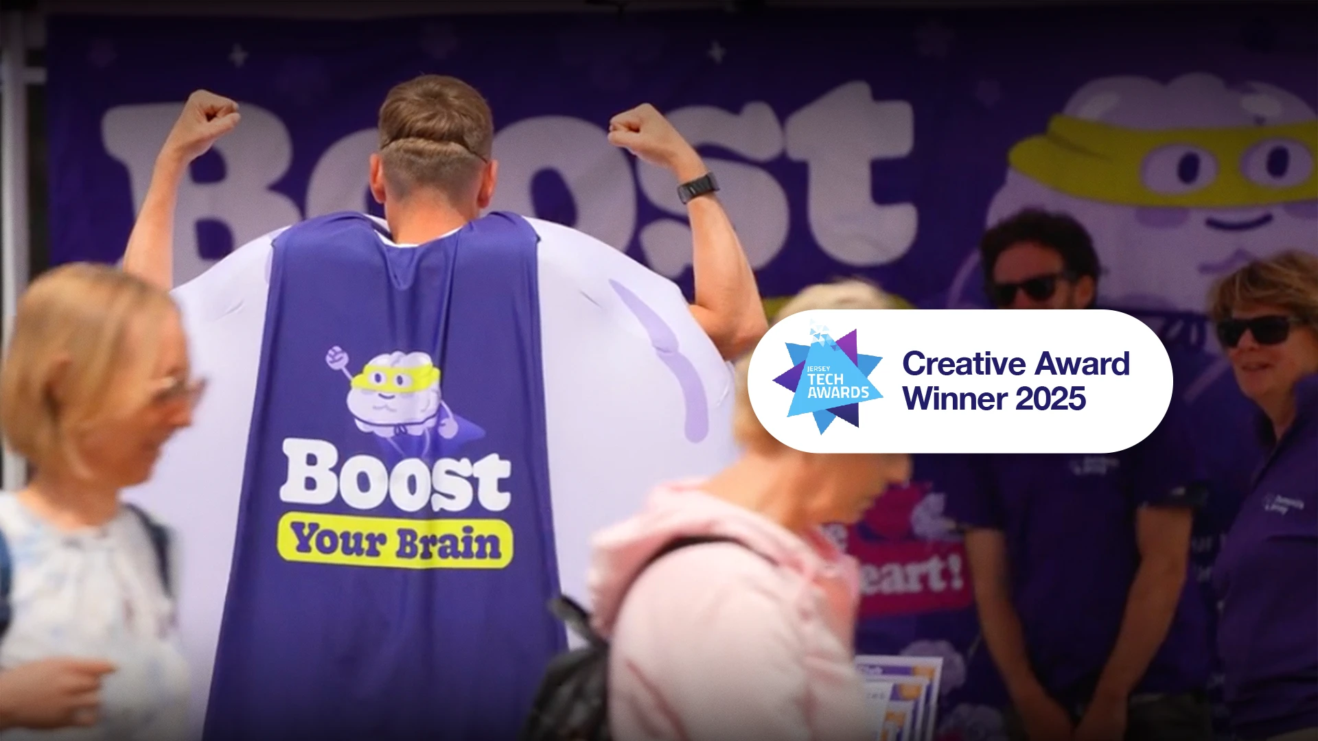
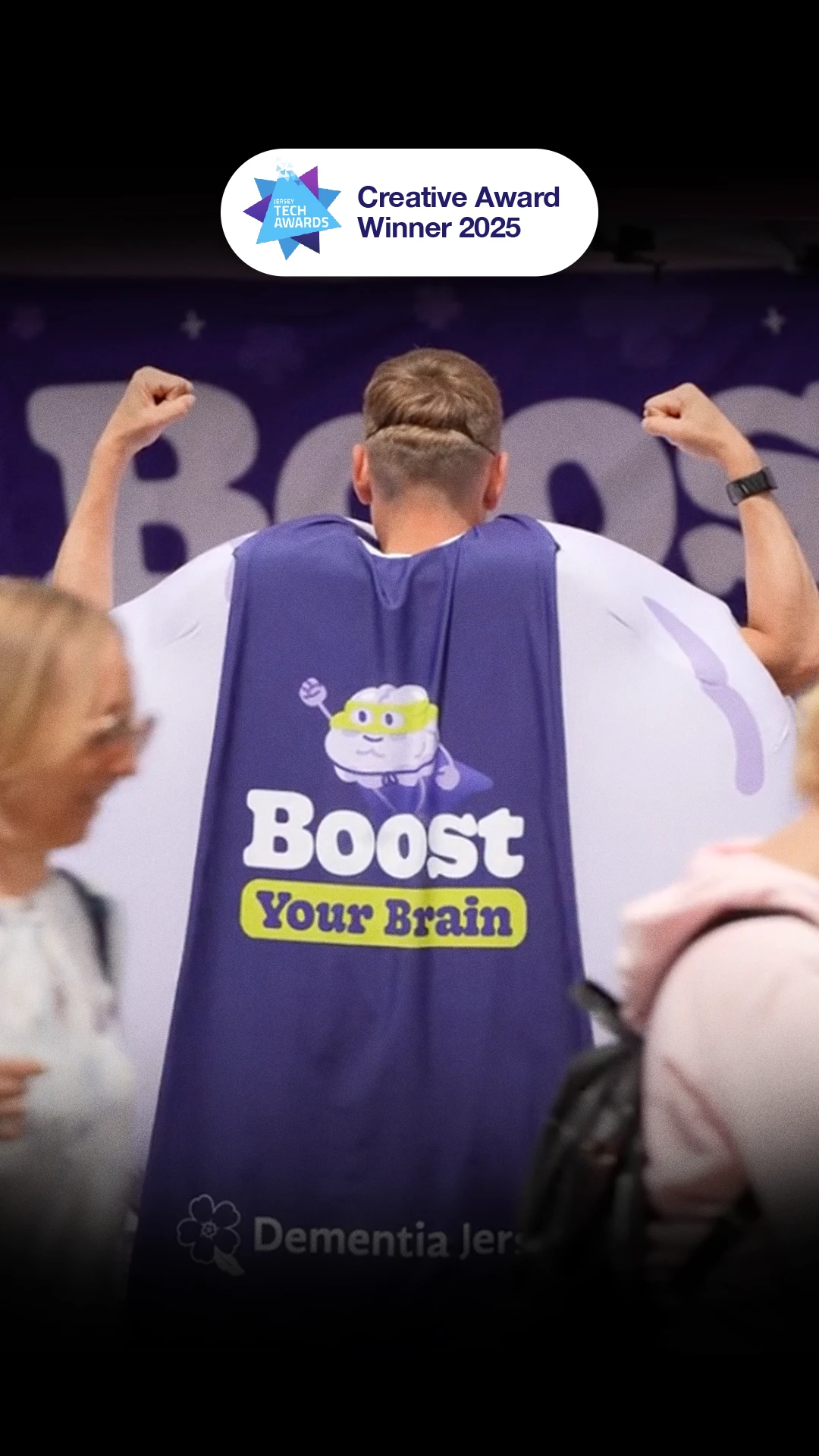
We bring your brand to life in the real world, across channels, formats, and touchpoints. Grounded in strategy. Built to perform.
Campaign Strategy
Performance Marketing
Social Content
Performance Marketing
Social Content
Email Marketing
Video Marketing
Ongoing Campaigns
Video Marketing
Ongoing Campaigns
The good stuff
starts here.
Industries we work with
Tech
Fintech
Accounting
Healthcare
e-Commerce
Charity
Wellness
Real Estate
Environment
Professional Services
Recruitment
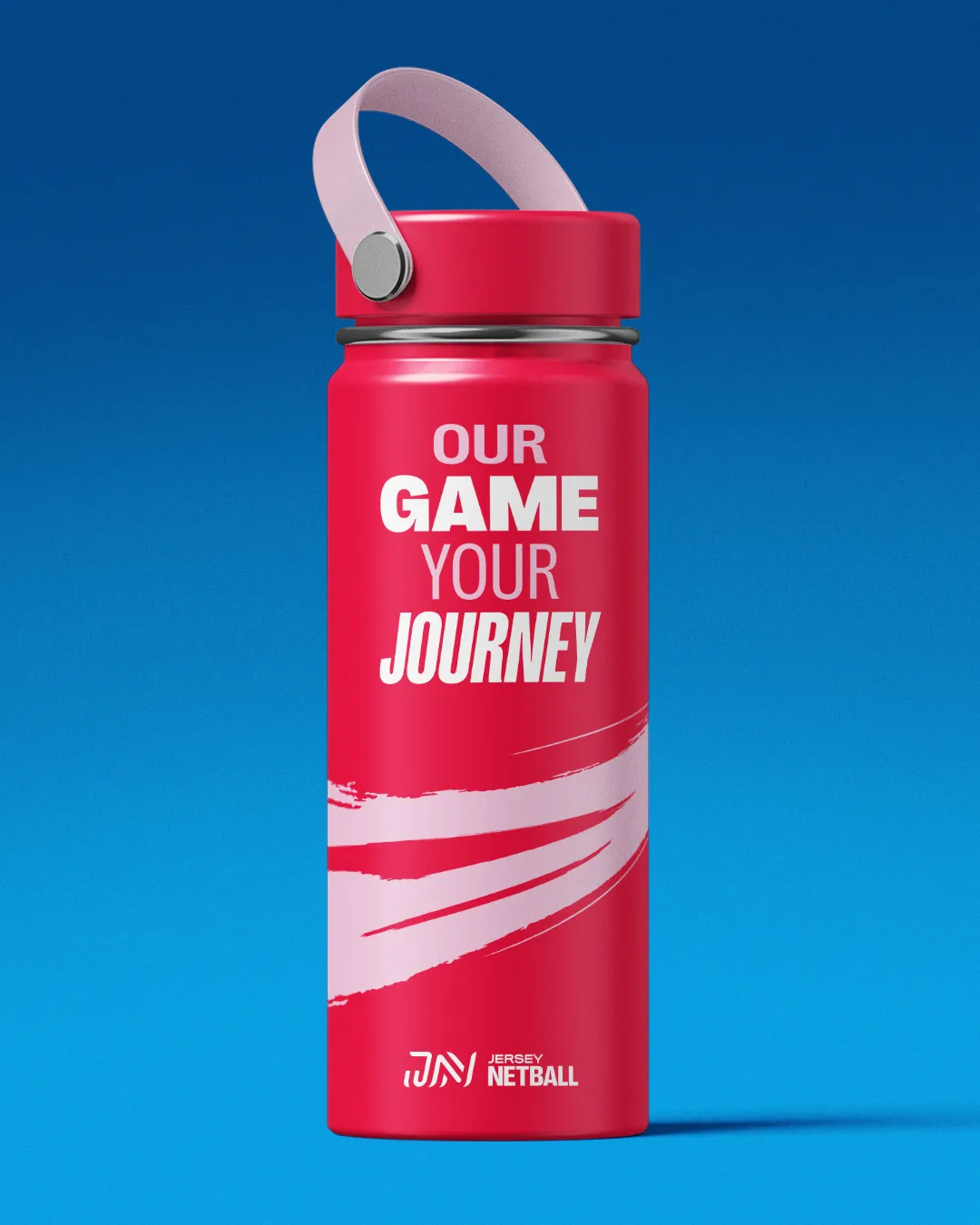
Sports
Education
Sustainability
Startups
Beauty
Food & Hospitality
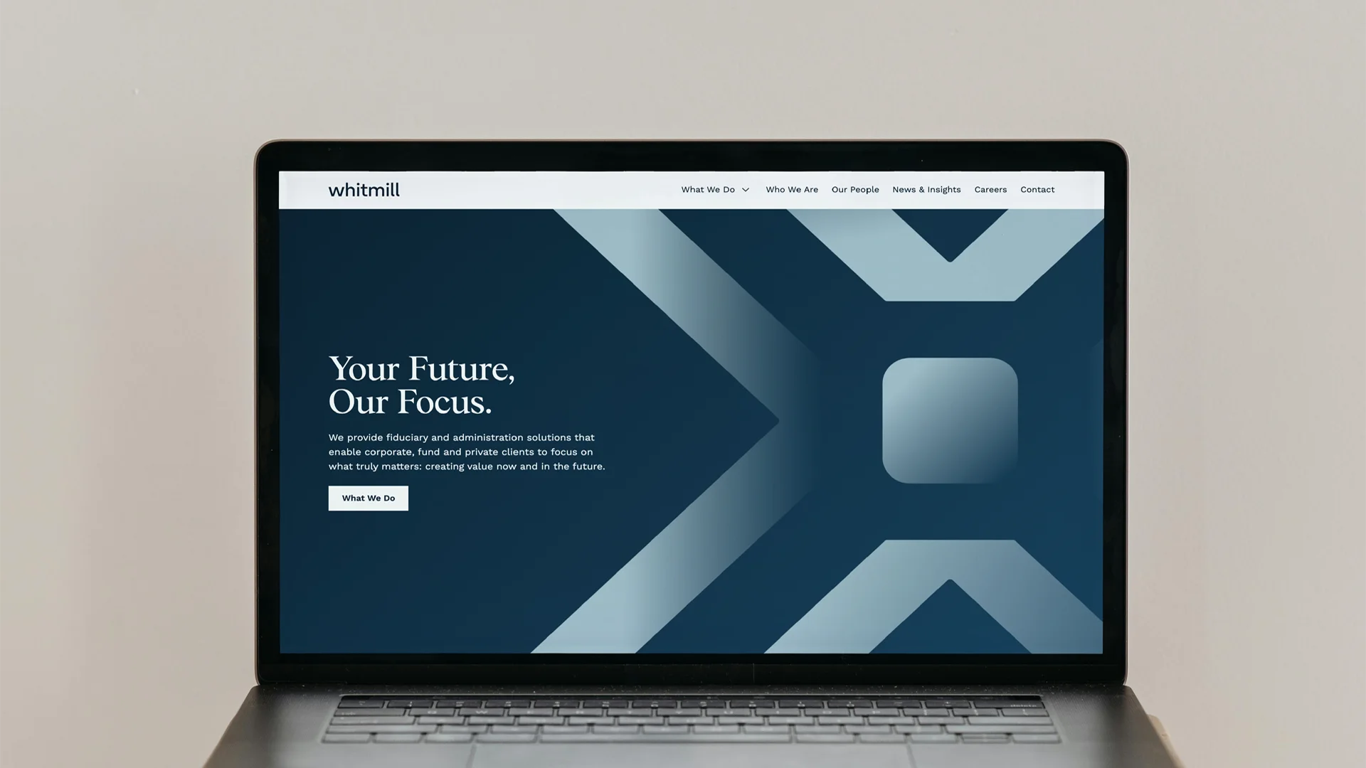
Trust & Corporate
Retail
Tech
Fintech
Accounting
Healthcare
e-Commerce
Charity
Wellness
Real Estate
Environment
Professional Services
Recruitment
Sports
Education
Sustainability
Startups
Beauty
Food & Hospitality
Trust & Corporate
Retail
Let's shape what's next.
The world’s noisy, competitive, and changing fast. We help you cut through and stay ahead. From insight to execution, we create work that’s not just good-looking, but brand-building and future-ready.