Buckden Partners
A Refined Brand & Digital Presence.

Positioning for Excellence.
Our team took a multi-faceted approach to revitalising Buckden Partners’ brand image. This included several key steps to create a cohesive and impactful brand identity.
Our approach
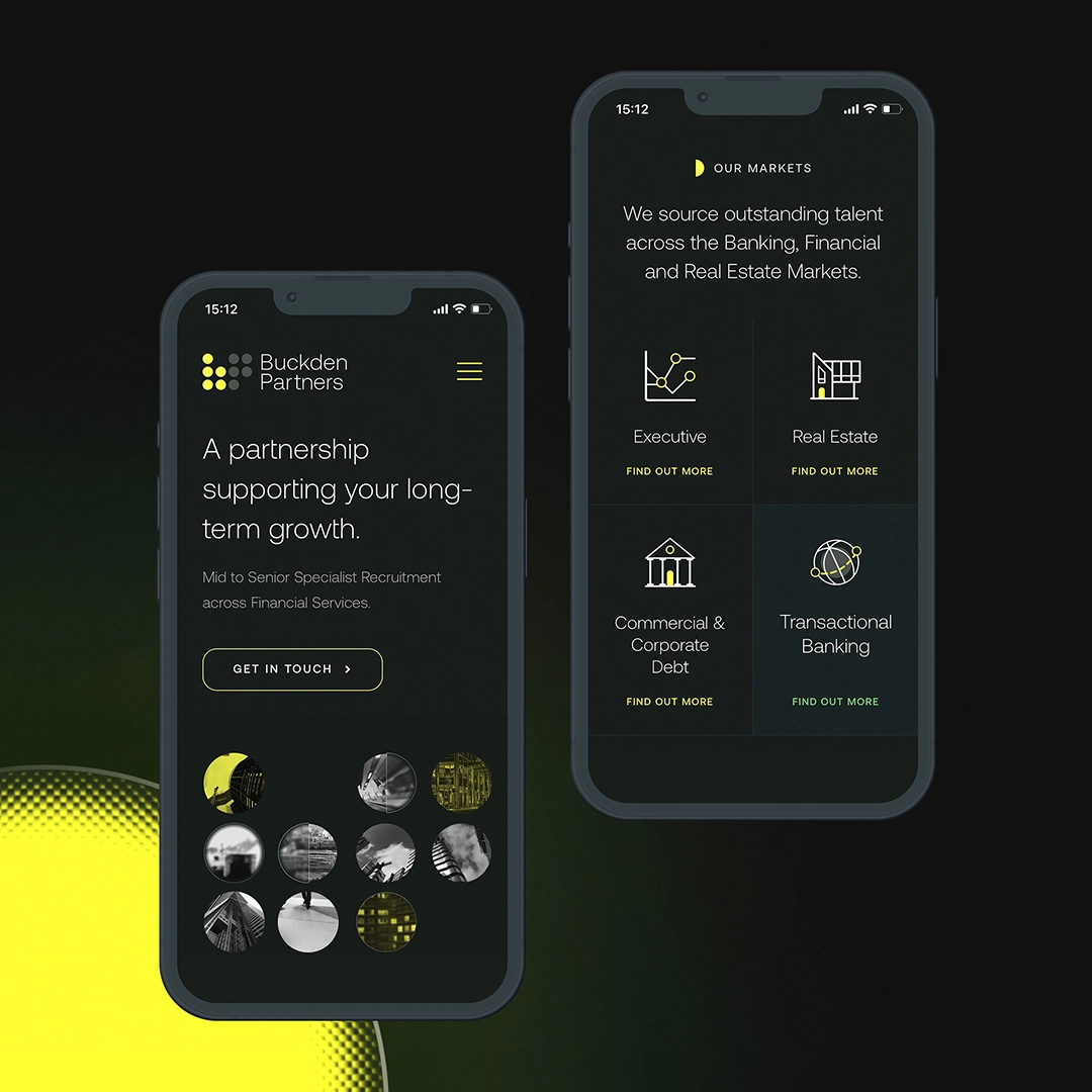
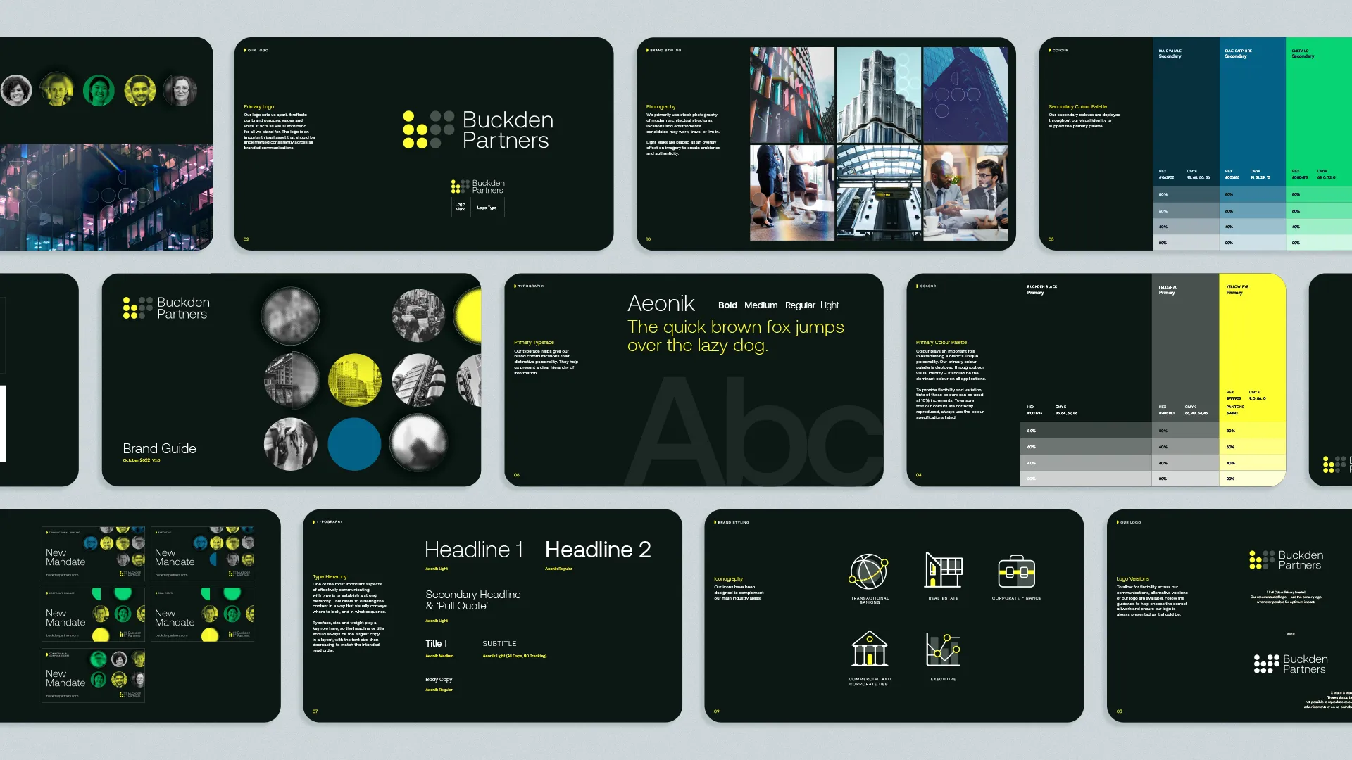
Firstly, we updated the Buckden Partners logo with a light weighted sans-serif wordmark. We then produced a new colour palette system complete with custom iconography for each of their market areas. Using a glass morphism style for the brand, we could emphasise the employee search aspect of the business. This approach not only created a visually striking design, but also helped to convey the company’s focus on finding the best talent for their clients.
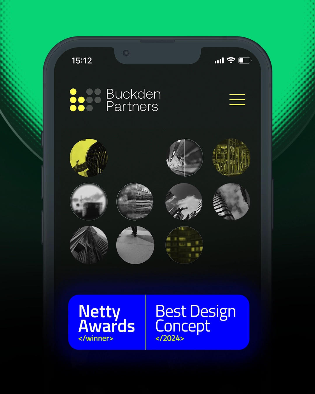
With the brand system in place, we developed a fully custom website to showcase the company’s services, processes and values. Designed to be visually engaging and easy to navigate, it provides potential clients with a clear understanding of Buckden Partners’ expertise and commitment to delivering outstanding recruitment solutions, with clear call-to-action areas for clients and candidates to get in touch. The website also boasts a dynamic hero video that incorporates the Buckden Partners logo mark. The circular shapes from the logo come to life with video footage of various offices, suburban settings, and transportation scenes, providing an immersive representation of the daily experiences of their clients.
Let's shape what's next.
Looking for a partner who can match your ambition? You're in the right place.
